Basic Design and Layout
Qtrade’s MobileWeb relies heavily on icons to orient users through the website. The homepage is organized into a 3×4 grid (see left image below) from which users can access different functions or pages of the website.
From a design perspective, navigating sections takes some getting used to and while the icons on the homepage are labeled, the functionality of the icon is not described. The absence of descriptions can make it challenging for users to navigate to sections of the website quickly.

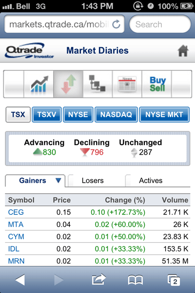
Navigating from section to section was made a bit more challenging by the use of ‘shortcut’ icons at the top of certain pages (see right image above). While they could be useful for doing similar or related kinds of activities, such as ‘managing a portfolio’ the lack of labels forces users to remember what section each icon is associated with. With 12 icons to remember, I found myself relying more on the homepage rather than the ‘shortcuts’ to move between sections.
Within each of the pages, the sections were reasonably clearly laid out and the research-related functions managed to provide lots of data without a user feeling overwhelmed. The use of tabs and buttons helped to keep information accessible without a lot of scrolling.
The device used in the test, an iPhone 4s, is also now on the ‘smaller’ end of the screen size scale when it comes to smartphones and superphones. Larger screen sizes would be able to access and display the layout of information without users having to scroll as much as they might have to on older devices.