
The big story for Canadian online brokerages in 2014 was undoubtedly lower commission pricing. For 2015, however, it appears that Desjardins Online Brokerage has clearly cast user experience and design into the spotlight as they prepare for the launch of their newly redesigned website.
SparxTrading.com was fortunate enough to get an exclusive first look at Desjardins Online Brokerage’s new website and, by all accounts, their new website raises the bar for their discount brokerage peers to step up in both function and form.
One Step at a Time
The new Desjardins Online Brokerage website is another iteration in a coordinated series of improvements to their online user experience.
Last year, for example, they released a newly designed investor education calendar that appeared to presage this new look and feel. Further, in our profile of Desjardins Online Brokerage, Vice President and General Manager Laurent Blanchard revealed an upcoming refresh to the website was in the works.
As a firm that prefers to discuss features that they are confident they will deliver on, the suggestions of a new website have been few but present for those paying attention. According to internal sources, the Desjardins team are both proud and excited for the upcoming milestone launch of the new site which is scheduled to go live by the end of February 2015.
Walking the Online Walk
The irony of succeeding as an online brokerage is that you not only have to be able to succeed on the transactional side (i.e. provide the service of online brokerage), but also demonstrate that you understand and can respond to the constant evolution of being online. As the storefront of their online presence, the look, feel and performance of a website will definitely factor into what visitors think of the brand and whether or not ‘they get it’.
While many of Canada’s online brokerage websites don’t get it ‘wrong’ per se, so few have embraced what the US online brokerages already have in terms of simplified design and function for a multi-screen world.
The drastic design difference between Desjardins Online Brokerage’s new website and anything at other Canadian discount brokerages, however, may spur competitors to pay attention to the importance of what a site looks and feels like in today’s world. If, for some reason, it does not, there’s all kinds of data to suggest consumers will choose to use a better designed product (just ask Apple).
New Features
In form and function, Desjardins Online Brokerage’s new website has several important upgrades over their current site.
First, finding information is much easier. The design elements on the new website help make information easier to spot and easier to retrieve. Using the blocked design (e.g. putting things in squares) makes viewing the website on a tablet or mobile device easier and substantially more efficient to navigate.
The top and bottom menus are clear, intuitive and well-spaced out. There is a manageable number of choices (five) with the most important for most DIY investors (finding out about fees and getting in touch with client service) easily accessed from the top menu.
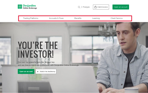
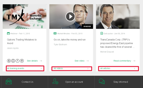
Another defining feature is accessibility to investor education. Desjardins Online Brokerage is one of a few Canadian brokerages that has invested heavily in investor education and their homepage layout clearly reflects that. The new website clearly positions educational events and investor education video content prominently on the bottom of the page. This means that clients and non-clients alike can view this information easily and quickly.
Finally, it’s just interesting to look at. The prominent video background of a fictional investor named ‘Nicolas’ is definitely eye-catching however there is also a very slick market data and stock quote interface that invites users to look up a symbol via Desjardins’ website. Mixed in with the thoughtful visual elements, there is also a good balance between static and dynamic content as well as sections that can slide open or closed.

As is often the case with good design, the devil is in the details. Paying attention to design reflects a well-thought out, user-focused experience however against limited time and finite resources there’s inevitably things still to do. In the case of Desjardins’ website, one of those key pieces will be enabling online account opening. While they’ve acknowledged it’s on their list of features to implement, in the interim, the new website will offer some improvements to the current form-based process.
The Bottom Line
For a Canadian financial services firm, especially one tied to online investing, to capture the look and feeling of being ‘current’ is noteworthy. More importantly, however, the new Desjardins Online Brokerage website has shone a light on the importance of translating website user experience into what people think about the brokerage. The new website reflects the broader trend with current websites generally: that paying attention to users matters. With the noise of commission pricing now fading, creating a great end-to-end experience is a message other Canadian brokerages will start to receive loud and clear.
Now that commission levels are pretty comparable at most of the discount brokers, trading platforms, account features etc. will be where potential new customers should be looking to differentiate..
Thanks for the comment Sultan. Your assessment is spot on. It’s going to be harder for discount brokerages to compete on commissions alone going forward. The new website from Desjardins Online Brokerage is just one example of the wave of non-commission price changes that are coming across the board (there’s at least one other brokerage apparently working on a new website and they probably aren’t alone). More importantly, the new sites have to be able to communicate those new or value-added features and help the discount brokerages to differentiate themselves from one another.